
先看一下效果图
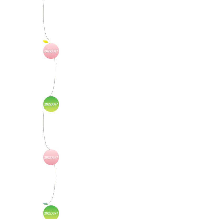
代码:
<!DOCTYPE html>
<html>
 <head>
  <meta charset="UTF-8">
  <meta name="Generator" content="EditPlus®">
  <meta name="Author" content="">
  <meta name="Keywords" content="">
  <meta name="Description" content="">
  <title>Document</title>
  <style type="text/css">
body {
  font-family: 'Microsoft YaHei','Lantinghei SC','Open Sans',Arial,'Hiragino Sans GB','STHeiti','WenQuanYi Micro Hei','SimSun',sans-serif;
}
.ulbox ul li {
  margin-left: 150px;
  list-style-type: none;
}
.circle1 {
  width: 23px;
  height: 200px;
  border: 1px solid #918f7e;
  border-radius: 100% 0 0 100%/50%;
  border-right: none;
}
.circle3 {
  width: 23px;
  height: 200px;
  border: 1px solid #918f7e;
  border-radius: 0 100% 100% 0/50%;
  border-left: none;
  margin-left: 22px;
}
.ulbox .cont1 {
  position: absolute;
  /*background: #049dff;*/
  background: #ee9ca7;  /* fallback for old browsers */
background: -webkit-linear-gradient(to bottom, #ffdde1, #ee9ca7);  /* Chrome 10-25, Safari 5.1-6 */
background: linear-gradient(to bottom, #ffdde1, #ee9ca7); /* W3C, IE 10+/ Edge, Firefox 16+, Chrome 26+, Opera 12+, Safari 7+ */


  border-radius: 50%;
  text-align: center;
  overflow: hidden;
  color: #fff;
  width: 60px;
  height: 60px;
  line-height: 60px;
  /*top: 10%;*/
  font-size: 12px;
}
.ulbox .cont3 {
  position: absolute;
  /*background: #fdba04;*/
  background: #DCE35B;  /* fallback for old browsers */
  background: -webkit-linear-gradient(to bottom, #45B649, #DCE35B);  /* Chrome 10-25, Safari 5.1-6 */
  background: linear-gradient(to bottom, #45B649, #DCE35B); /* W3C, IE 10+/ Edge, Firefox 16+, Chrome 26+, Opera 12+, Safari 7+ */


  border-radius: 50%;
  text-align: center;
  overflow: hidden;
  color: #fff;
  width: 60px;
  height: 60px;
  line-height: 60px;
  /*top: 40%;*/
  font-size: 12px;
  /*left: 21.5%;*/
}
.fol1 {
background: #f6ea00;
border-bottom: solid #c9dd58 1px;
display: block;
padding: 3px;
width: 10px;
border-radius: 0px 4px 1px 6px;
text-align: center;
margin: 1px;
text-decoration: none;
color: #C7DC58;
height: 2px;
line-height: 2px;
transform:skewX(30deg);
}
.fol3 {
background: #86b8b4;
border-bottom: solid #c9dd58 1px;
display: block;
padding: 3px;
width: 10px;
border-radius: 0px 4px 1px 6px;
text-align: center;
margin: 1px;
text-decoration: none;
color: #C7DC58;
height: 2px;
line-height: 2px;
transform:skewX(30deg);
}
  </style>
 </head>
 <body>
<div class="ulbox">
	<ul>
    <li>
	<div class="circle1"></div>
	<em class="fol1">~</em>
	<label class="cont1">2022/3/7</label>
	</li>
    <li><div class="circle3"></div>
	<label class="cont3">2022/3/7</label>
	</li>

	<li>
	<div class="circle1"></div>
	<label class="cont1">2022/3/7</label>
	</li>
    <li><div class="circle3"></div>
	<em class="fol3">~</em>
	<label class="cont3">2022/3/7</label>
	</li>
</ul>
</div>
 </body>
</html>